Sage | UX redesign
Re-design of the User experience for the career search page at Sage. Creating a design which explores how the career search and job profile pages can be improved.
My Role:Product designer
- UX design
- UI design
- Interaction design
Empathise and Research
To start with I need to understand the full user journey, who they are, how they think and feel when looking for a job.
“As we are lacking the user research deliverables, a lot will be based on assumptions and heuristic evaluations.”
User Interviews
These are the sort of questions that I would like answered.
Questions for candidates.
- When would you look/apply for a job?
- After being made Redundent
- Career progression
- Personal learning
- A company you are watching has a role you would suit
- What is most important to you when you are looking for a new job?
- Would you consider a career change?
- Have you heard of Sage?
- What would attract you to work for a particular company?
- ETC...
Questions for recruitment staff
- What are candidates looking for in a new role.
- ETC...
Usability testing
Usability testing would offer lots of insights in this project. It would find trends in the issues users are having.
- Have input on the script
- Watch the test if possible
Surveys and feedback questionnaires
Discuss with the research and marketing team best ways to get survey results effectively.
- Surveys via email
- Surveys in the street
- Interviews with candidates
Persona's
Based on the interviews that were conducted and the research we can build up some user persona's.
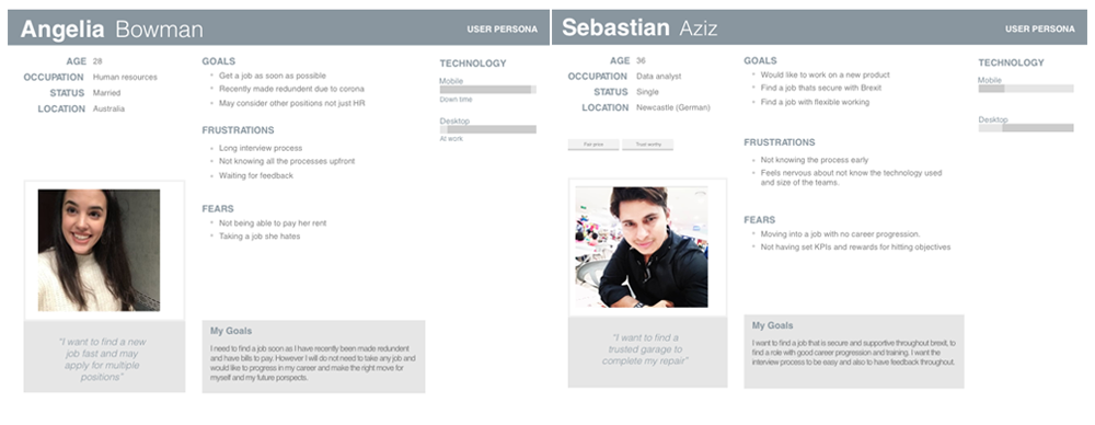
“Work in any country, concerned about brexit and covid, wants flexible working, less urgent.”
Sebastian
“Urgently needs a job, would consider a career change, would like to be notified of jobs”
Angelina<
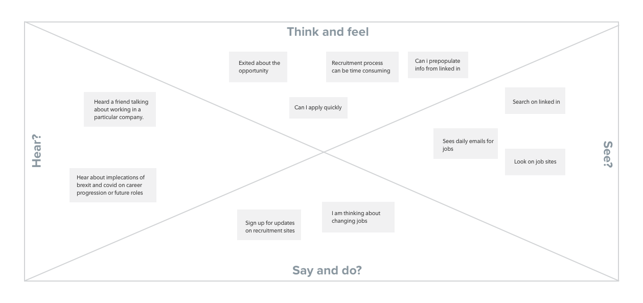
Empathy diagram
Gather thoughts and feelings from the research phase.
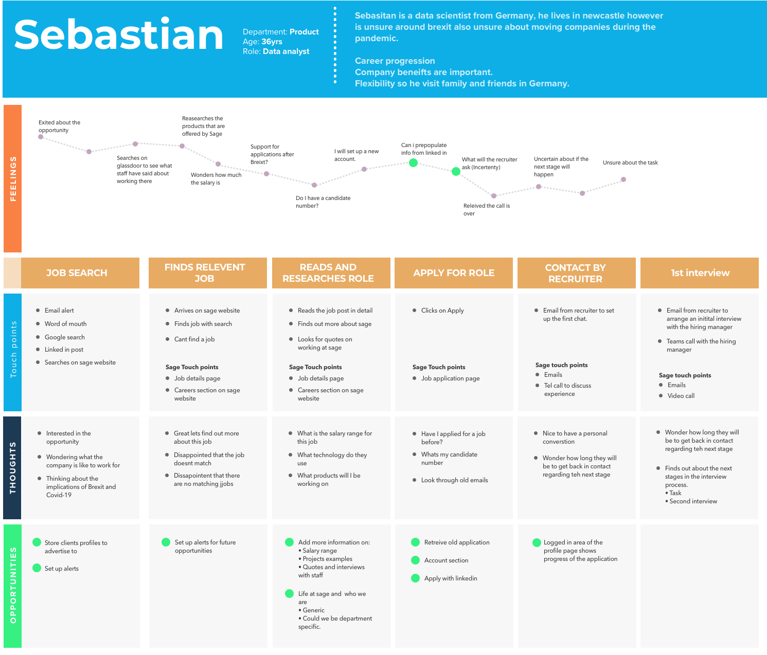
User journey map
Gather thoughts and feelings from the research phase, and define a user journey based on a persona.
Competitor analysis
I looked at several recruitment sites so see how they presented roles. Xero, indeed.co.uk, otta.com/
Request information with Data analysts
At this point its good to involve data analysts to see what information we can gather.
- Drop of points in the funnels.
- Where do most candidates come from?
- Which funnel has more success (Currently there are two journeys).
- Do we have drop off when creating an account, how often are the job posts shared?
- Hotjar could also be used to see if there is anything trends in drop off and to gather insights into user behaviour.
Assumed findings and heuristic review
Since we don't have any research this is based on my heuristic evaluation and assumed findings. This is a nice resource to look for potential improvements 10 Usability Heuristics
- Job search
- The country select and the list of experience types are a little confusing.
- Where is the search? I would expect to see a search box.
- I like the top career tips and candidate journey sections.
- Do they have vacancies in all countries?
- Career search page (Results)
- Different countries have different page layouts. (Lack in consistency)
- No feedback when using the search inputs, if we have no results.
- The input placeholders and selected options are the same colour.
- Location input is redundant without using the country input and no feedback.
- Job preview tile is large and has lots of text.
- You can select a country with no results and there is no indication of the failed search.
- Call to action is "Apply now" - possible place to test different wording.
- The google language change doesn't work when switching between sections.
- Results / Search page (careersrow-sage)
- If you select Australia/Malaysia it opens a new portal.
- No indication of which countries jobs portal you are in.
- If you search for a job that's not there the experience is bad. Errors and no indication that you can view other vacancies etc.
- The job listing page with the additional search at the top and list of jobs is nice.
- Job details page
- Opens in a new tab with design changing.
- careersrow-sage seems to have a better experience with keeping you on the same area.
- Missing key information to help the user make a choice. (full time, part time, salary, interview process, who you would be working with, what projects I would be working on, people moving up)
“I am making the assumption that each user from each country has the same user needs. (Could each country have a different funnel with different user needs? Would each role have different user requirements?)"
Country specific users and funnels
Define and analyse
This stage is to gather all the findings from the research phase to build up user stories, problem statements and trends to help understand the problems they have and define possible improvements.
“Gather all research together into affinity diagrams to notice trends. Include the recruitment team in a workshop to review findings"
Create Affinity diagrams and host a workshop
“List out all the features based on findings, rate and sort them."
Card sort and rate importance of content
User stories
- As a candidate I want to know what the interview process is.
- As a candidate I want to be able to apply quickly and easily.
- As a candidate I want to save the job and see progress of application.
- As a candidate I want to know working methods, team structure.
- As a candidate I want to know salary ranges.
- As a candidate I want to know career progression possibilities.
- As a candidate I want to apply for jobs in different countries.
- As a candidate I want to have consistent layouts and languages.
- As a candidate I want to see the date a role is posted.
- As a candidate I want to see career progression.
- As a candidate I want to see how many people have applied for the role.
Prioritization matrix and MVPs
There are a few different ways we could go with this project, there are also smaller quick wins (Content shuffle, text changes, input styles) and larger improvements that would involve larger dev commitment (Sign up for updates, Save for later, account set ups etc) and without knowing how much dev resource timescales its hard to go into this in any more detail.
“This would be a good point to define quick wins, hotfixes and larger pieces based on dev time, UX improvement and design time"
Prioritisation matrix
Design, prototype and iterate
Now that I have a good understanding of the user needs and the problem statement I can then set out designing the flows, wireframes, interaction designs and prototypes, so we could test and iterate.
Keep our personas and problems in mind throughout the design process.
Sketches
My first step once I understand the problem is to sketch out some user flows and possible journeys and rough ideas.
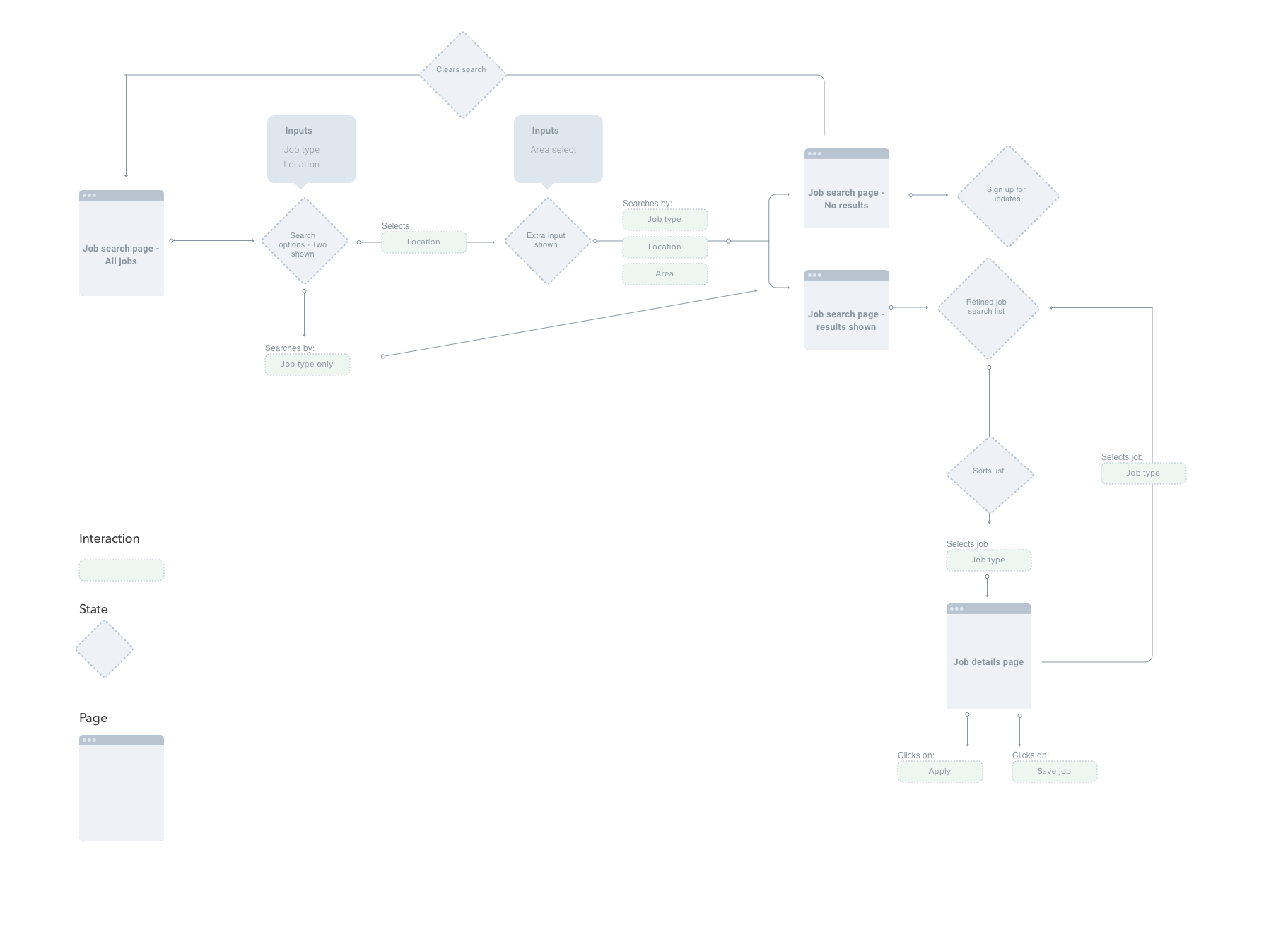
User flow
I have a good idea of the potential flow so I move into sketch and start to plan it out.

Interaction flow
Now that I have the basic flow planned out I canmove onto planning out the states and page flows in more detail.
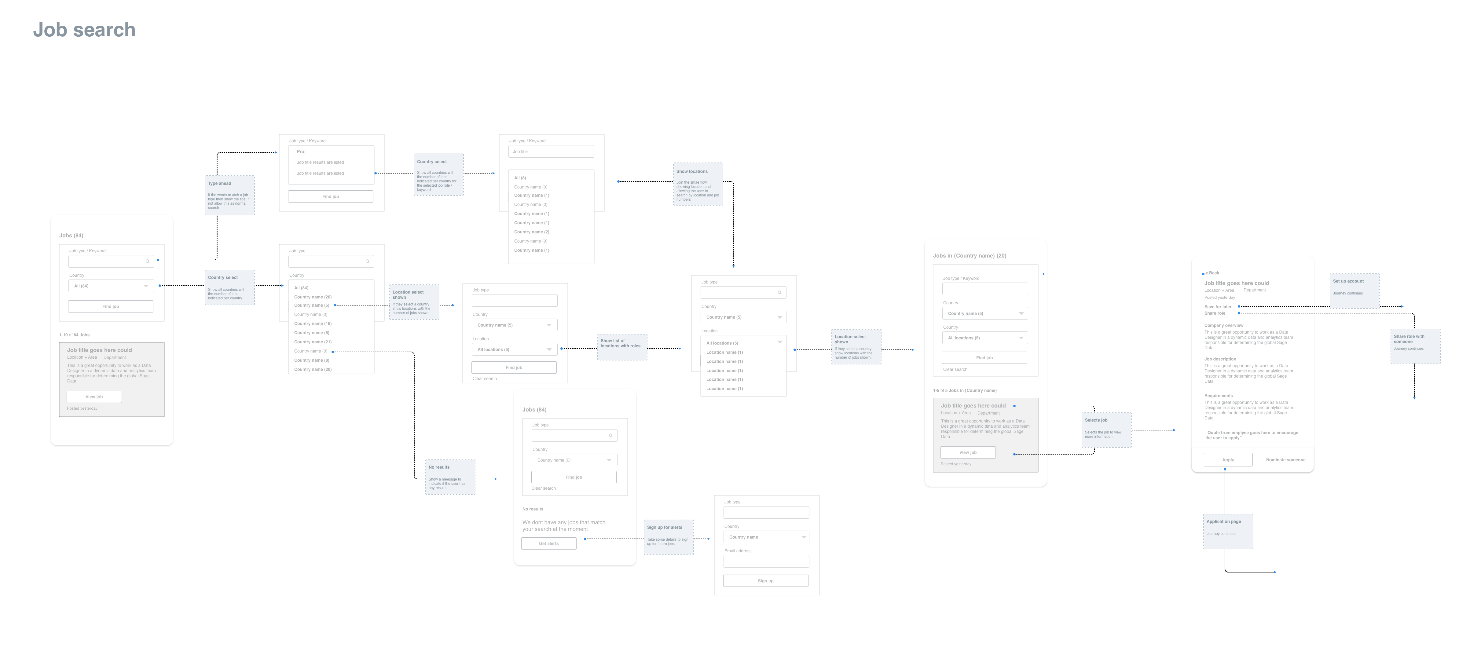
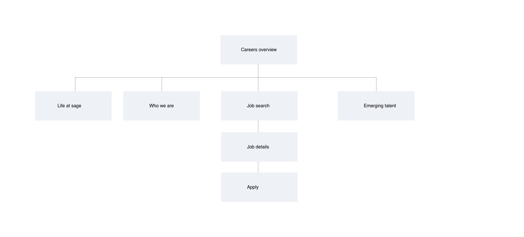
Wireframe flow
I then build up more detailed wireframe flows to understand the states and flows in more detail.
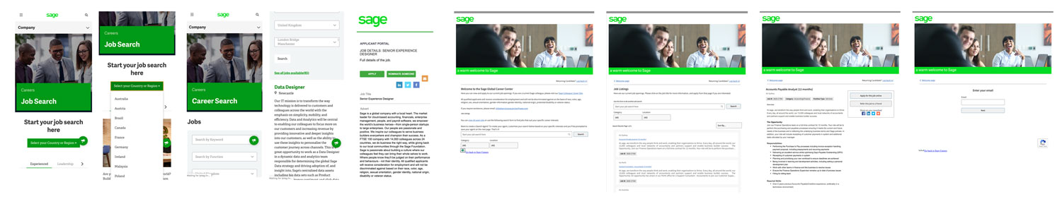
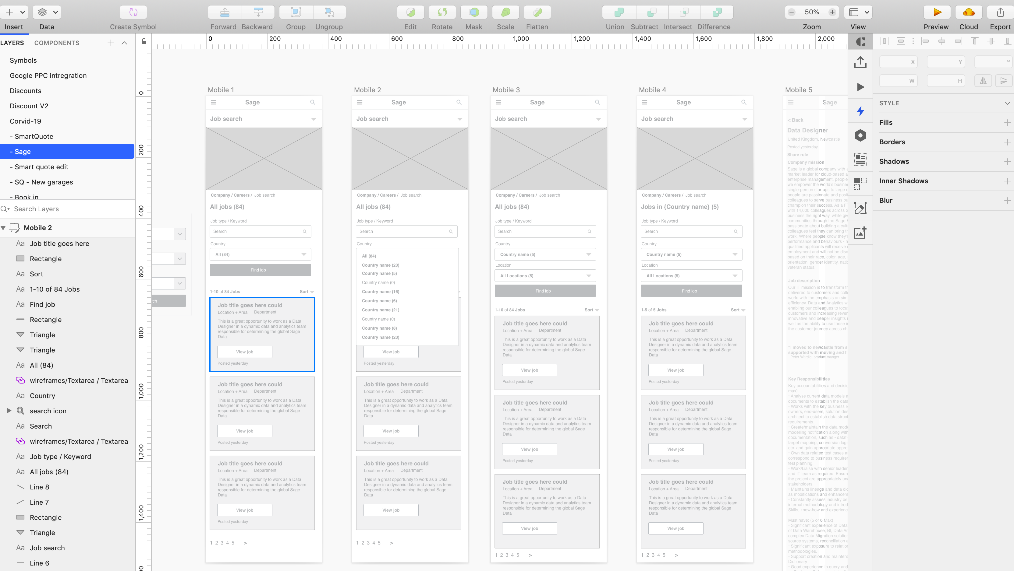
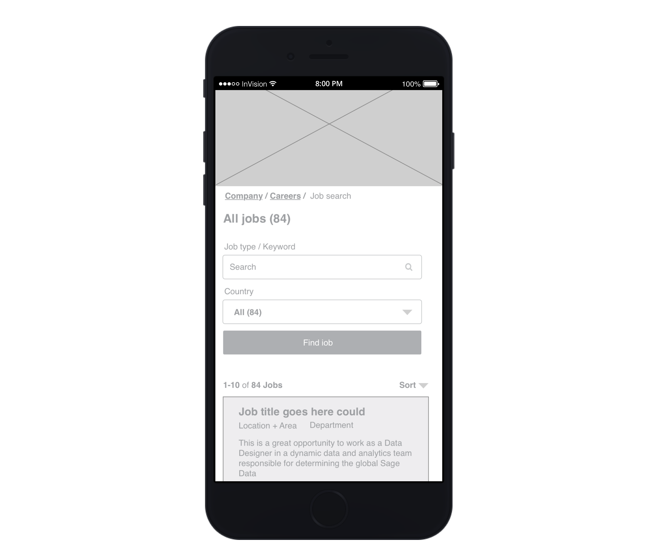
Wireframes
After I am happy with how the flows will work and the different states of the pages I moved onto the more detailed wireframes. Showing the position of elements on the pages and allowing me to then create a click through prototype.
- Key changes
- Reduced inputs on search, and rework.
- Indication of job numbers per country.
- Allow user to sign up for alerts if no job is visible.
- Lots of users will arrive on the job details page first so this has to house a lot of information and allow for easy navigation.
- Changes to the navigation
- Changing the main navigation name to show the current page
- Breadcrumbs to allow you to move around
- Job search landing page is now the search inputs and results page
"The Job search landing page is now the search inputs and results page. Finding out about sage etc is now accesed through a more obvious menu."
"Prototype made with invison to Invsion click through"
"Testing the wireframe at this point with real users would be advantageous if possible."
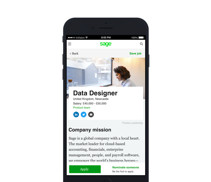
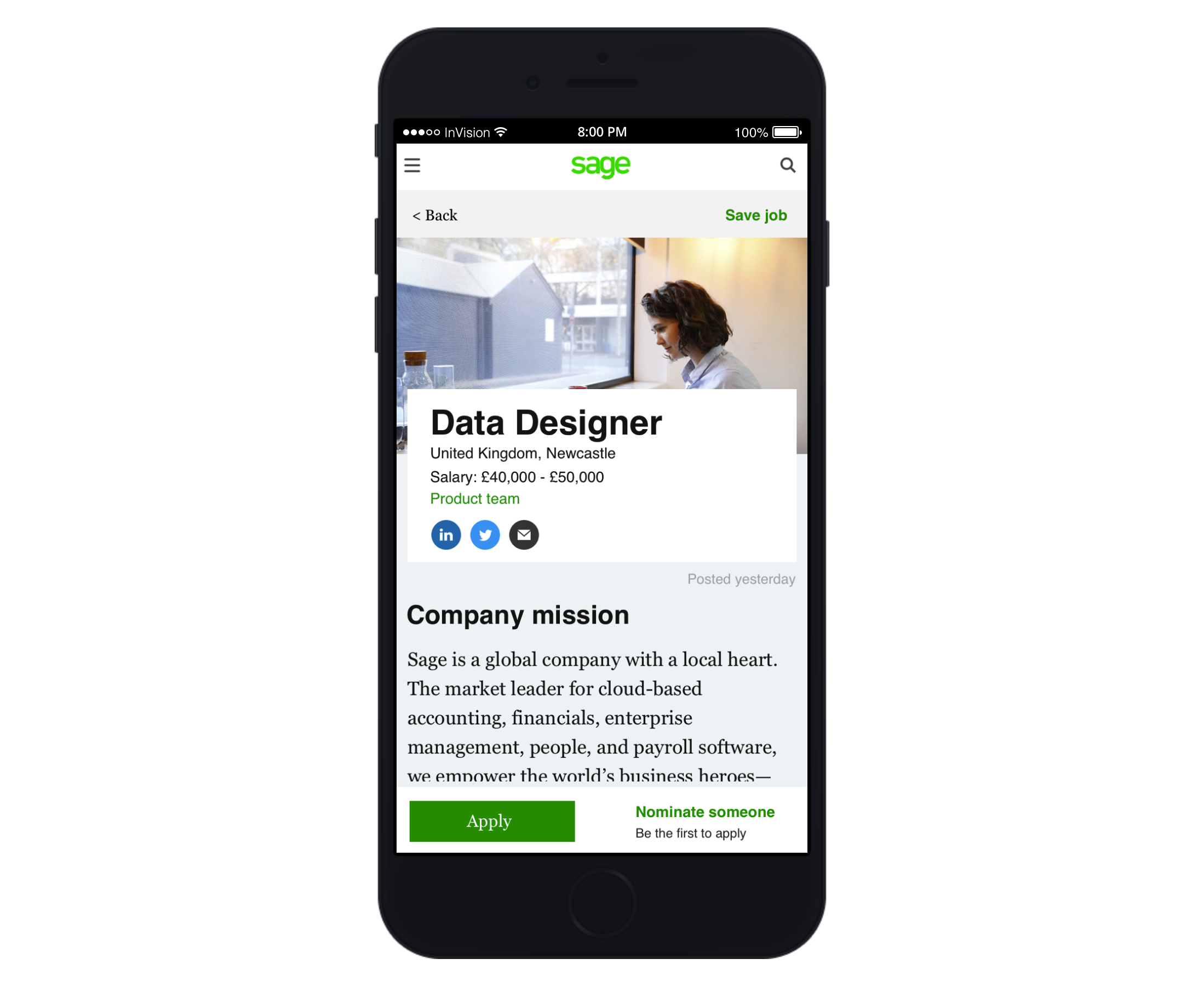
UI design
Finally I would use elements from the style-guide / pattern library to build up the high fidelity designs, creating new elements if needed.
I have only designed the job details page to show how the new features would work. I have taken style queues from the blog page as this seems to follow the new content styling rules.
"View invision prototype Invsion click through"
I would split the task up with the product manager into several smaller releases to monitor and to gauge the increase in engagement based in improvement KPIs.
- Smaller releases
- Hotfixes
- Smaller A/B tests
- Larger MVP release
- Define any KPIs to define success
- Release this as a MVP with A/B testing of new and old
- Release per country and treat each separate funnel
- Get reports from the data analyst team to monitor results
Next steps:
- If KPI's are improving then release on the other funnels.
- Request further user testing if possible
- Work on V2 to experiment with featured jobs, featured quotes from employees on search page and sign up for alerts.