Launch start up | Money Guru
Money guru is a comparison site that went from 0 - 180k monthly users in its first few months and became the fasted growing comparison website in the UK in 2017. I lead the user-centric approach to user research, analysis, ux design and ui design. We continually monitor and improve the experience based on user research.
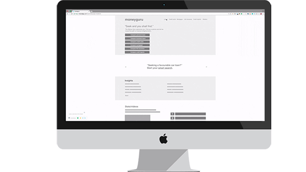
I am going to give a brief overview of the initial release and then focus on a later release to show a more detailed process.
My Role: Lead UX /UI designer
Duties: User research, UX design, UI design, Interaction design
- UX design
- UI design
- Interaction design
- Project specification
- Iteration
0.1 | UX Research

- Competitor research These included confused.com, gocompare.com, comparethemarket.com and moneysupermarket.com.
- Analytics research We had the original site ukloans to base gather our analytic data from. Not the best but this was enough to start until we had a MVP.
- Surveys and questionnaires We added hotjar to the site to gather as much data as we could on the users behaviours. This monitored all types of user interaction and allowed us to add surveys and polls to the site.
- User stories These are my first point of call and we wrote over 100 user stories to delve into what the users needs were.
- User personas Were used to study in depth key stories and find out what issues and goals they have.
0.2 | UX analysis
- User story maps Help me to view the whole project and detail how each persona would achieve their goals.
- Card sorting Help me to prioritise these features.
- Affinity diagrams used to group content and define content.
0.3 | UX design
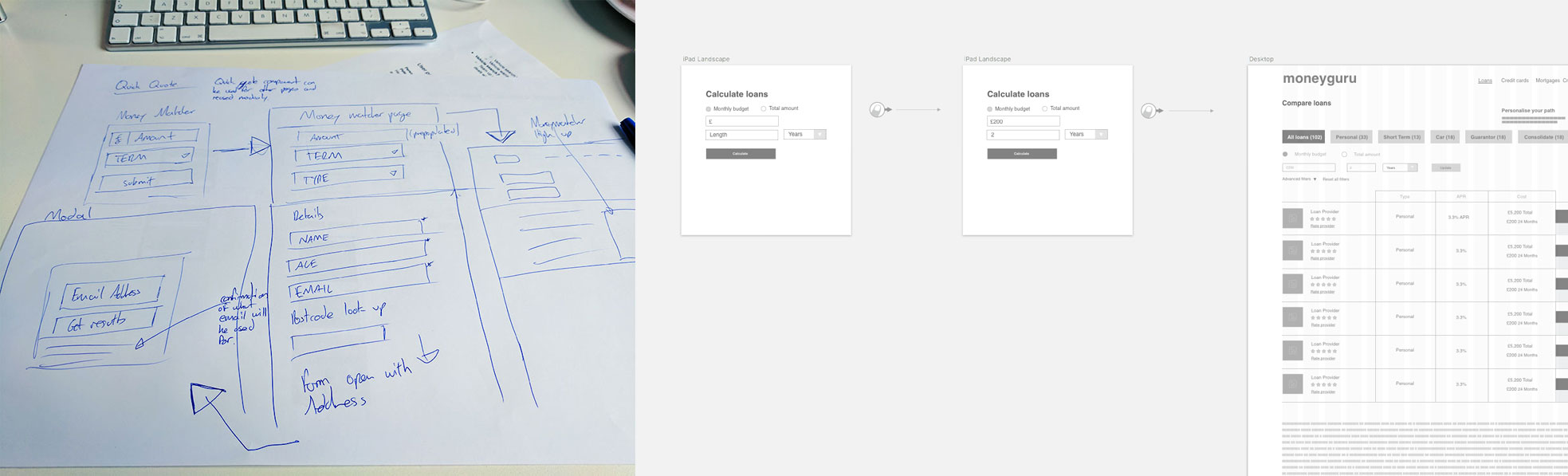
- Sketching This is an important step of my process and allows me to quickly think of flows, components, possible solutions and quickly iterate are discard.
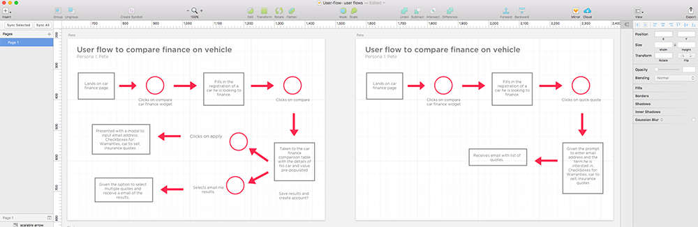
- User flows Help me to detail each interaction for each personas journey to its completion and discovers how they achieved their goals.
- Interaction design Planning out each interaction and designing how each step is carried out, detailing any notifications and feedback. I like to supply prototypes to showcase this to developers.
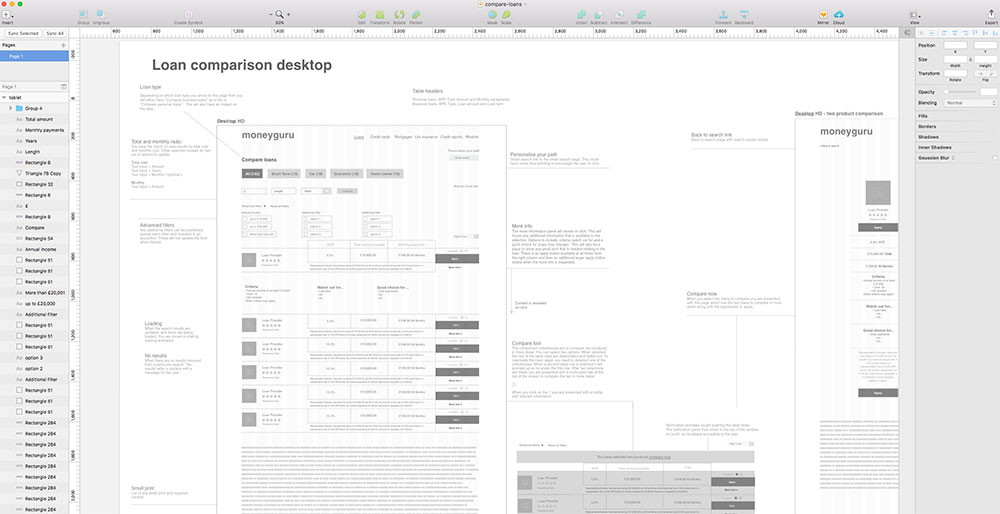
- Wireframes I use these as a deliverable for developers / the client and also to define the content structure and any extra interactions.
0.4 | Prototype
- I created several prototypes of individual component flows and also the full app to test internally and supply to the client (ideally this would be the first user test).
- Sketch is my software of choice as it's has lots of functionality to speed up the design process.
- Marvel app I used Marvel and principle to create prototypes, however, as a front end developer I can quickly code HTML, CSS and Javascript prototypes
0.5 | UI design


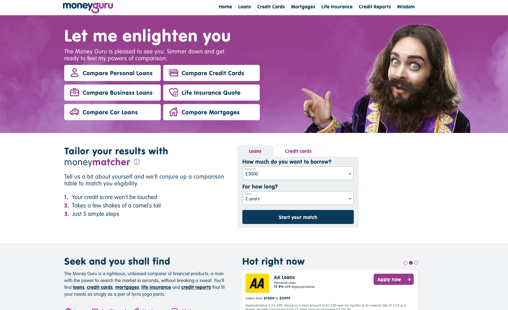
Using the style guide and branding guidelines, high fidelity designs were created. I also like to supply animated examples of how I want the interactions and flows to work.
0.6 | Usability testing

- Lab usability test An extensive usability test was carried out to test the brand and all functionality.
0.7 | Results of Usability testing

- User journey maps & affinity diagrams Using the Usability test results I created user journey maps and affinity diagrams to find pain points and barriers.
- Prioritisation Matrix We then created a matrix to work out the impact on user against technical feasibility and design / UX feasibility of the issues we had found. Allowing us to include quick wins in one release and larger components in single releases.
“Using the prioritisation matrix we worked on a initial release in phase 2 to iron out some quick wins.”