WhoCanFixMyCar | Our assumptions are as follows:
- 1) User needs work done and has found us.
- 2) User finds the garage profile.
- 3) User doesn't want to, or doesn't know they can post a job but do like the look of the garage. There are no contact details available - so they exit, google the garage details and book direct.”
Assumed problem statement
“As a driver I would like to book an appointment with the garage easily and quickly."
User goals
- As a driver I want to book my car in for an MOT / Service.
- As a driver I have an unknown issue with my car I want to get it fixed as conveniently as possible.
- As a driver I want to book an appointment for a garage near my home.
- As a driver I want to find the details of a garage.
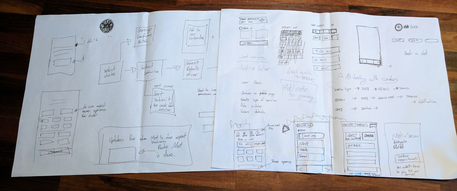
Sketches
First step once we have a problem statement is to sketch out some user flows and possible journeys and rough ideas. I would often at this point try to create some prototypes with paper to test out different ways to approach the process.
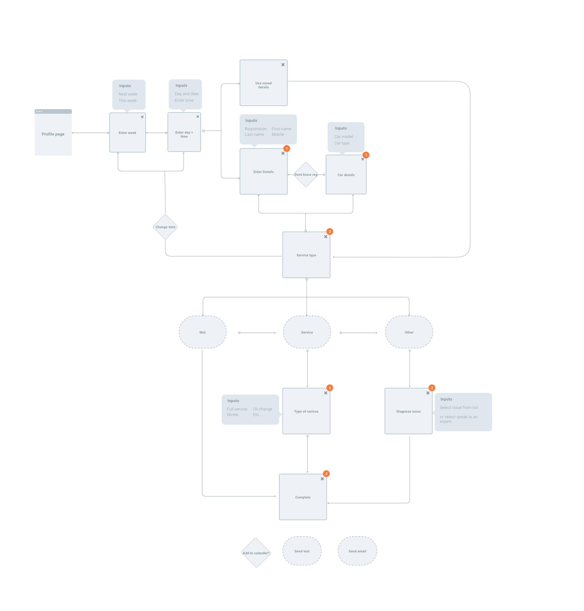
Interaction flow
Once decided on a process I started to plan out in more detail how the user will input data, complete the booking and move through the process.
"I tried to stick to the core user journeys, time permitting I would investigate other journeys further."Download high res interaction flow
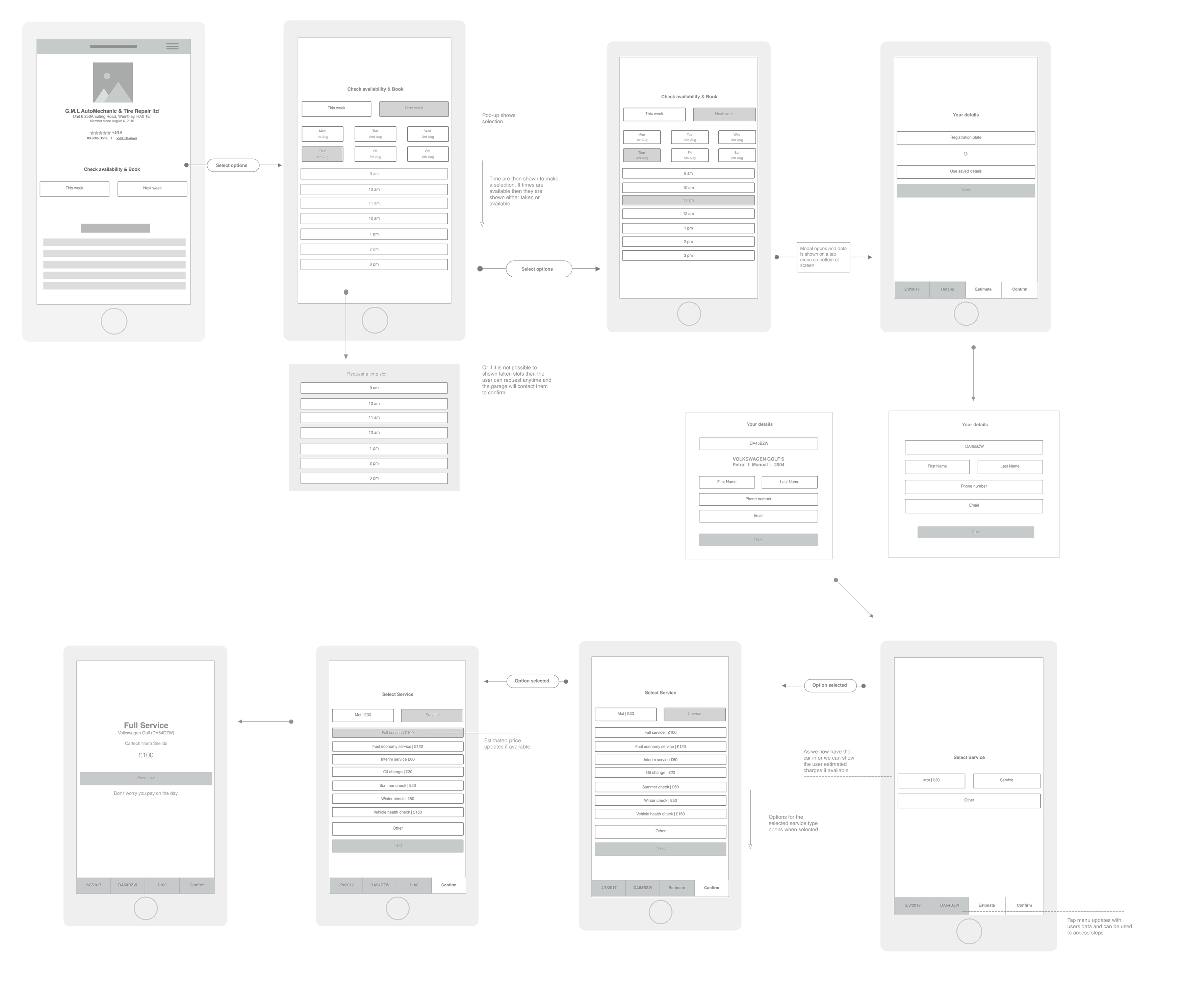
Wireframes
Next I looked at wireframing the different screen states. This shows the user flows in more detail including notes on how the interactions would work. Time permitting I would go into more detail with the labeling and documentation.
- Key features of new structure
- Tap bar to access elements of form.
- Estimate cost for selected services.
I then created a click through prototype using invision. This iteration only takes in one flow, ideally I would expand this to make a full prototype to test.
"If the garage has no way to show available times then the user could select any time and the garage would confirm the appointment."Download high res wireframes
Design
I then added some design styles to the wireframes and started to build up the steps in a little more detail. I have changed some of the colours slightly to modernise the colour pallette.
I like to supply an example animation using principle to help demonstrate how the interactions could work. This makes the hand over easier to explain.
- Key features of new design
- Refresh of colour and styles used.
- Introduction of illustrations.
“If you were looking for a brand refresh in the future you may want to have bespoke illustrations created depending on the direction of new brand styles.”


Next steps
- More research into the user goals and a problem statements to decide on extra flows.
- Validation and error handling.
- Test This week and Next week do we need to add in more options?
- A/B test the order of the start of the form."
- Usability tests.